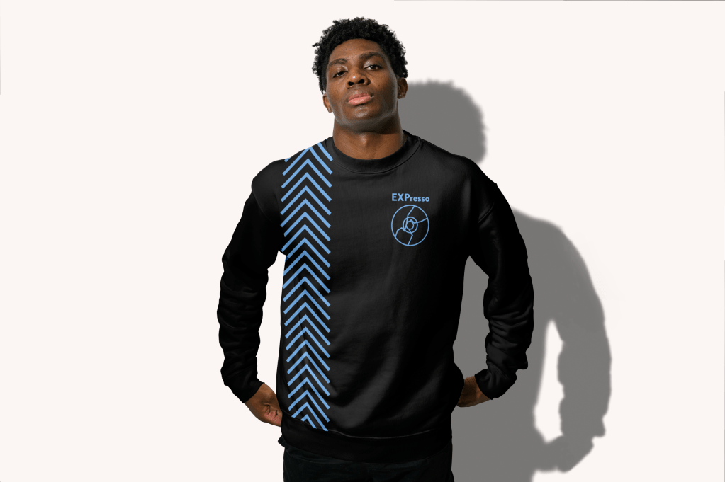
EXPresso was my first major graphic design project. I created a ficitonal drink company with goals, statements, and a target audience. Then I took over its branding including designs for the products, marketing, and examples of the brand in the intended world its meant to occupy. After much trial and error, and thinking about ways to subtly nod towards my target audience of gamers, I landed on a cracked disc as the logo for the brand.
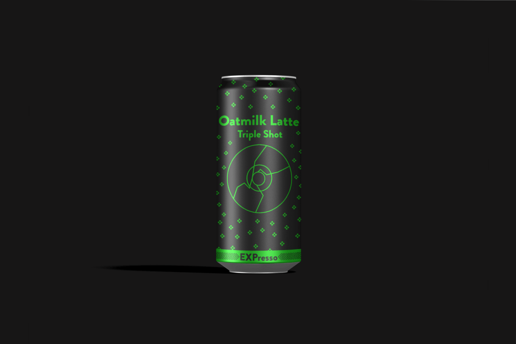
I had a large mood board for this project and ended up pulling inspiration from a mixture of exisiting energy drinks and canned coffee. This inspiration fit my companies brand identity of wanting to make canned espresso drinks marketed towards gamers. I started off too “coffee house” in my inital designs, color palette, and mock ups. I decided to embrace a bit more of the “gamer” aesthetic and introduced bolder colors.
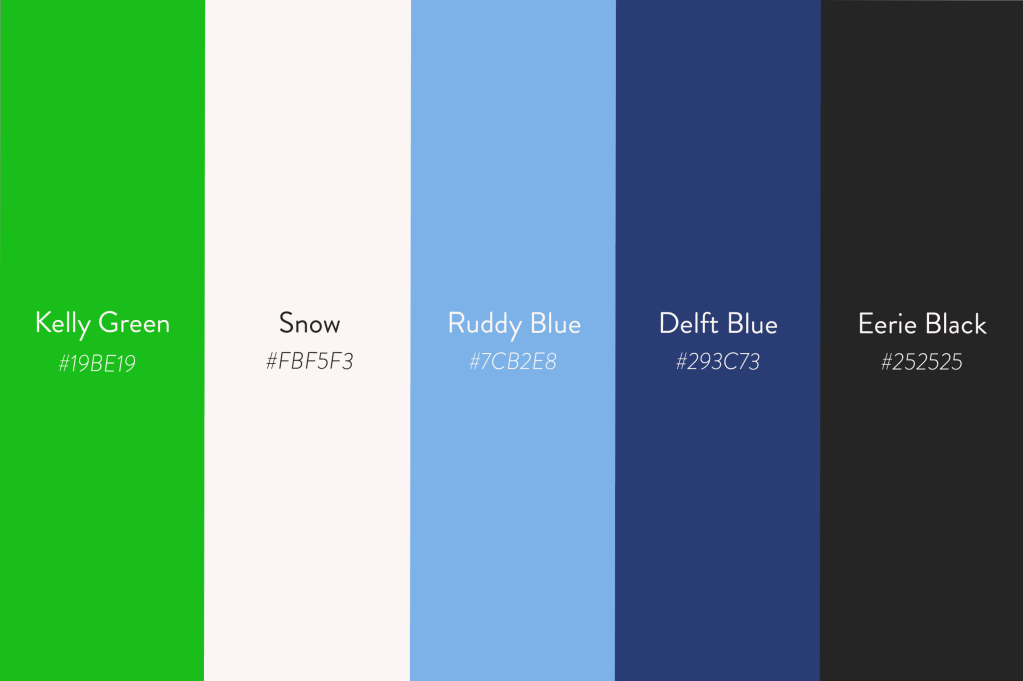
After landing on a more vibrant and familiar color palette I had to think of how to shape the remainder of the branding designs around these bolder colors.
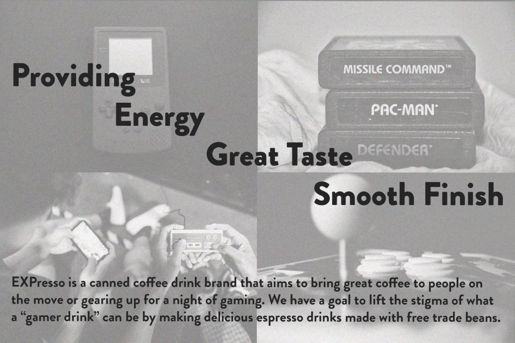
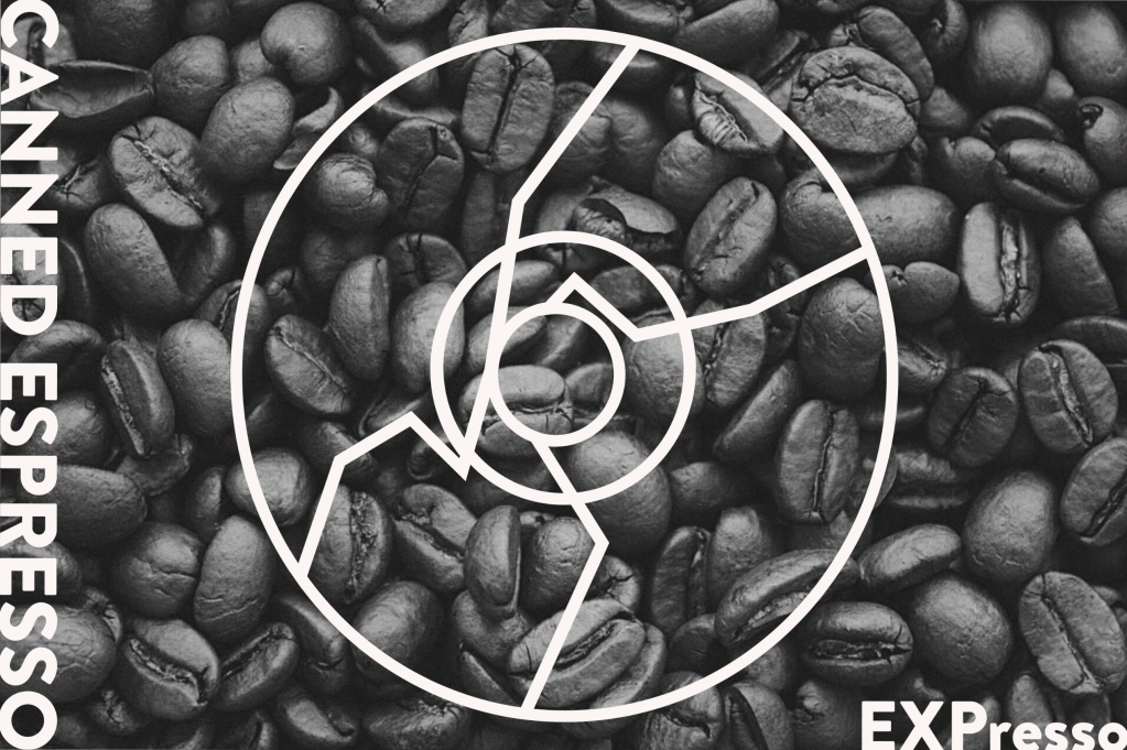
I chose to go with fadded retero gaming stock imagery accompanied with the companies messaging and goals. I thought the dicotomy would balance out the color palette and help drive home the idea that this brand belongs in the world of gaming.
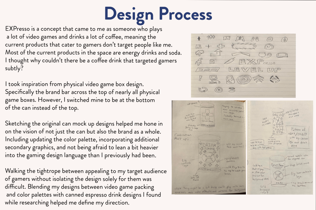
I did a good amount of sketching on paper before ever touching the Adobe Suite. This really helped me with trial and error, bouncing ideas around in my head on paper and allowing me to more easily make drastic changes without messing up my design files.